Wednesday 21 October 2009

Magazine Presentation


This powerpoint shows the feedabck that i recieved after showing my school front cver to a number of different people, i also evaluated my front cover.

Mock up of Magazine Cover


On this plan for my magazine i thought about what and how it is i could make it different and stand out from other peoples and not just follow the same old coventions of typical magzines that already exist.

That is why i made my masthead be on the left going up on its side, also the cover lines were all aligned to the right, so i didn't follow the left third rule.

Language

Mode Of Address:
In lesson we learnt about the mode of address and there were two types to attract the audience.

Direct- this includes text like 'You' , 'Your' etc. for example:
"You know you love her"

Indirect- Its not directly adressing the audience. For example:
"Best dressed Teens"

The Register:

Formal: formally spoken

Informal: some slang -NO jargon or buzz words

Colloquial: extreme slang( street talk only what your peer group understands)

Inclusive: Example: "Your most stylish summer" everyone can think about this.

Exclusive: Example: " Mortifying first day of school experience". Only targets people at school.

My Changes to my Magazine


I made a few colour changes to my magazine, by changing the shade of the the colour. i had changed to a much darker purple so that it can stand out.

Wednesday 14 October 2009

My Magazine Cover

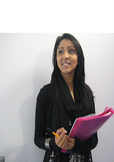
PLANNING THE FRONT COVER IMAGE

Agency Name: Chin Up!

Model: Tamanna Zaman

Camera Height/angle/distance: Medium shot

Location: indoor school

Lighting: Natural lighting

Mise-en-scene: Smart dress code, on a white or plain background for east edit

Atempted connotation: a clever high achiever in sixth form

Planned denotation: Smart dressed clothe, holding books, facing forwards but looking slightly up and have a pen in hand.

Contingency: Inside on any kind of wall

Alternate angle: Close up


Before editing
Before starting i had to make sure that the image will be on a an A4 sheet so to do this i went to File-New-Blank File. Then i went to my photo and clicked on Select-All. this allows me to select my whole picture, then i went to Edit-Copy, after i went on the Blank File and clicked on Edit- Paste. Once i did this a box will appeaer on the screen, from here i clicked on Preset-A4

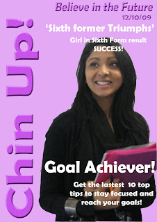
First I edited the photo using the spot healer tool, which has made the skin clearer. i also used the magnetic lasso tool to get rid of the background which was on the same layer and then i used the colour pallet, and using the paint bucket tool i clicked on the background.

Adding text
Adding a new text automatically adds a new layer: i used the font Berlin Sans FB Demi once i had written the text for my masthead ( Chin Up!) i selected an effect called overlay, then i rotated my text and added another effect called Simple sharp Inner which makes it stand out more from the page.

Font

Friday 9 October 2009

Editing


MAKEOVER
first i opened up photoshop and clicked on EDIT & ENHANCE PHOTOS , then i opened up the image called Model 1. Before doing anything to the picture, i dupplicated the layer, then i began to edit the picture by clicking on the spot healing tool, ehich removes the spots. After i created a new layer so that i can then make her face seem really clear and 'airbrushed' i clicked on filter-Blur-Gausian Blur- and then bluring the image to about 2.7 pixels, after i used the rubber tool to make her features n her face seem focussed.

EYE COLOUR
to change her eye colour i created a new layer and using the standard brush tool, i clicked on the colour pallet- selected a colour- then i clicked on the eye area. After this i used an effect called Soft Light- then Lowered the opacity which made it seem that this was her natuaral eye colour.

HAIR COLOUR
First i duplicated the layer that i used for the rubbering out tool, i clicked on Hue/Saturation- ticked the box 'colorize'- and i brought he Hue up, i am now inthe process of usinf the rubber tool to remoave the areas that i dont want , only leaving behind the colour left on her hair. eventually i will then i clicked on Soft Light- i went to filter-Blur-Gausian Blur

Wednesday 7 October 2009

Cloning on Photoshop


In this picture of the school the task was to edit the picture and remove the St Marylebone sign on the side, im order to do this i used the cloning tool on Photoshop, to select the colour of the sign and then colouring over the St Marylebone. I had to make sure that i had the right shades of the colour so that it didn't look like it was edited, i found this difficult becayse it maent that i had to constantly clone different areas of the sign to get the right colour.

Monday 5 October 2009

Editing photos on Photoshop


In these pictures(before and after) i used photoshop to edit the photo using the brush tool, i had to make many layers in order to add colour, and different textures and effects.

THE EFFECTS
i used the colour pallet to add a variety of colours and i used it on top of the picture, i did this a on a new layer, i then used the soft light effect to make the colours be apart of the background.

ADDING THE LOGO
i added the logo by first finding it on the internet and then i saved it a picture in my documents, i then opened it up in the Adobe Photoshop software, and holding down shift i resized the picture to fit the desired look.

Comparison Magazines


In this powerpoint I comapred 3 types of different magazine covers, i mentioned things that i liked and disliked and I gave my opinion on the use of colours and layouts of each magazine. i did this in so i can get a few ideas on what my magazine will look like.

Vibe Magazine Labelling


Vibe Magazine Cover Labelling
I decided to label the magazine called VIBE. In this powerpoint I labelled key points of the magazine cover.