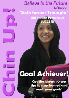
Agency Name: Chin Up!
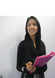
Model: Tamanna Zaman
Camera Height/angle/distance: Medium shot
Location: indoor school
Lighting: Natural lighting
Mise-en-scene: Smart dress code, on a white or plain background for east edit
Atempted connotation: a clever high achiever in sixth form
Planned denotation: Smart dressed clothe, holding books, facing forwards but looking slightly up and have a pen in hand.
Contingency: Inside on any kind of wall
Alternate angle: Close up


Before editing
Before starting i had to make sure that the image will be on a an A4 sheet so to do this i went to File-New-Blank File. Then i went to my photo and clicked on Select-All. this allows me to select my whole picture, then i went to Edit-Copy, after i went on the Blank File and clicked on Edit- Paste. Once i did this a box will appeaer on the screen, from here i clicked on Preset-A4
First I edited the photo using the spot healer tool, which has made the skin clearer. i also used the magnetic lasso tool to get rid of the background which was on the same layer and then i used the colour pallet, and using the paint bucket tool i clicked on the background.
Adding text
Adding a new text automatically adds a new layer: i used the font Berlin Sans FB Demi once i had written the text for my masthead ( Chin Up!) i selected an effect called overlay, then i rotated my text and added another effect called Simple sharp Inner which makes it stand out more from the page.
Font
Print Screen Of Font
View more documents from guest1d91823.
No comments:
Post a Comment